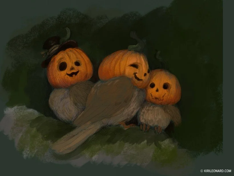
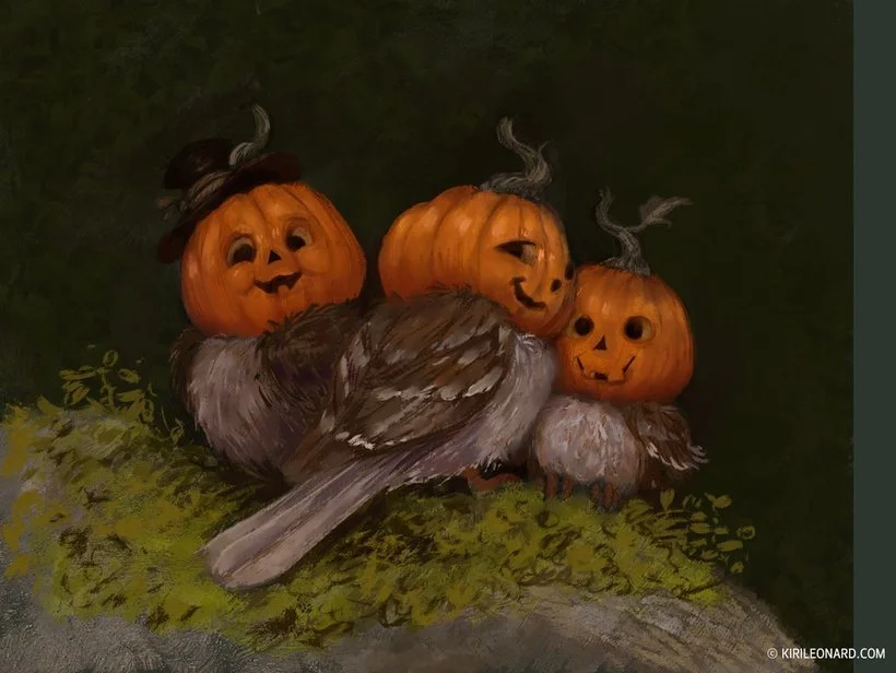
Painting an illustration for a Halloween Card
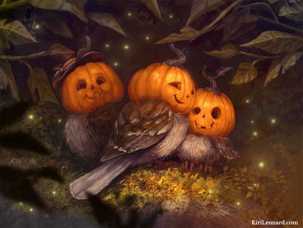
In this tutorial, I'll take you through the making of this year's annual Halloween illustration of the Pumpkin Sparrows. I am going to show you my full painting process from start to finish, and explain each step as well as give you some insight into how I use Photoshop.
I work in Adobe Photoshop on a Wacom Cintiq 27 HD Touch and use Greg Rukowski's brushes.
1. The Sketch
We begin with a pencil sketch. This drawing is done on smooth surface bristol paper with a mechanical pencil using 4B lead. Once the drawing is complete I scan it in 600 dpi and save it as a TIF file.
Using TIF format is important because unlike JPEG there is no quality loss of the image in how the file is saved. JPEG compresses the files and therefore impacts the quality, so you should always save your base files in TIF.

The initial Sketch for the Pumpkin Sparrows, Halloween Card
2. Base Color
The first thing I do is open my drawing in Photoshop, then I create a separate layer underneath my drawing. I color this layer with a base color that is going to be the foundation of my color scheme. I set the drawing layer to multiply which will make the white see-through. So now I have my painting foundation which looks like this:

Base Color Layer
3. Color Rough
Now I add another layer underneath the drawing but on top of the base color layer. This layer is going to have the base colors for the birds and surroundings. I use a large, crude brush to lay down these colors.
I'm just focusing on the larger shapes at this point and making sure the birds read clearly and are separated from the background tones.
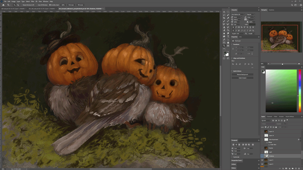
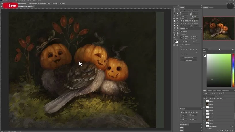
Let's take a closer look at the layer setups here. Here is what my Photoshop window looks like. We're going to focus on the far right panels. All the panels here my base tools in the program.
The top one shows a small thumbnail view of my painting, this is extremely useful for checking if your subject reads clearly and stands out from the background.
Below that is the color palette, I pick colors from here to paint with. Below is my layer list.
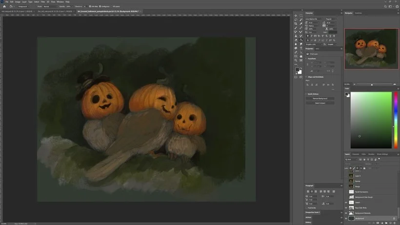
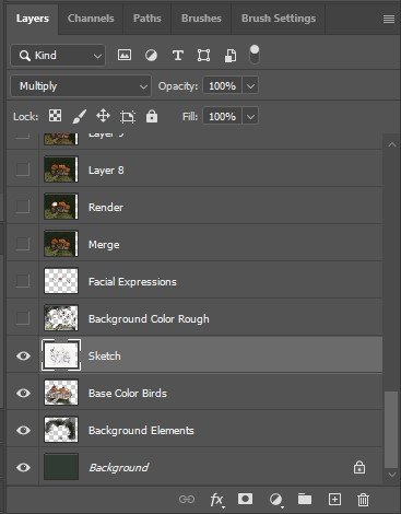
Let's take a closer look at the layers. Here you can see how they're organized. The background layer is the base colors, the next two are my color roughs for the characters, and then above those are the sketch. You can see the sketch layer which is highlighted is set to 'Multiply' on the top panel bar.
4. Finishing the Color Rough
At this stage, I fill out the background with a textured brush to get my underpainting finished. I'm using a brush that has some color distortion to it's not a flat green color. Sometimes it's a little lighter, sometimes it's a little darker. It creates a nice texture.
Ignore the lighter green sliver on the right, it's simply there because I end up expanding the canvas later to center the composition.

5. Rendering Begins
Now I create a new layer on top of my sketch. This layer is going to be my main canvas as I am now ready to begin rendering. I start by detailing the faces a little more and work on their expressions. I always love doing the face, so I often begin with that. Next, I begin working on the feathers of the wings.
I also add a little more foliage to the branch they're sitting on. I still haven't fully decided how I want the surroundings to look at this stage.
6. Color Adjustment Pass
Now that I have my overall color scheme down it's time to refine it. I'll usually do this several times as I work on a piece. In Photoshop I go to Image > Adjustment > Color Balance.
The Color Balance has a set of sliders you can play around with and adjust your colors as you see fit. It helps to get the colors more unified.

Here's the result. I warmed up the tones a little and bumped the purple slightly. It's a subtle difference, but it's enough that the colors read well together and don't come across as muddy.
7. Initial Shadows
I create a new layer on top of all the other ones and set it to multiply.

I pick a gray-greenish-brown color (the color of mud!), go in with a large brush at 30% opacity, and start carving out my shadows. This helps to boost the volume of the figures. It can be difficult to spot the difference when you're seeing still images, so for your convenience I've made a little GIF to illustrate what's happening here.
8. Light!
I repeat the same as in step #7, but this time I set my layer to 'Overlay' instead of 'Multiply' and use a soft orange color to paint in some light.
Alright friends, you still with me? We're about halfway through but all the hard parts are done. Now we're going to render a whole lot!

9. Experiment! You never know what might happen.
Remember when you were a child and you just made art for the fun of it? That is such an important thing to do. So while you're working on your artwork I want you to take some time to just experiment and have fun with them. Do it on a separate layer so you can always delete it if it doesn't turn out right. You never know! Sometimes happy accidents occur and you end up with a much more interesting piece.
For this one I played around with having the Jack O'Lantern heads lit. Ultimately I didn't like how it looked so I deleted it again, but it was fun to explore!

10. Time to add some drop shadows.
Again, on a separate multiply layer I grab my trust muddy brown dirt color for my shadows and I begin painting in the drop shadows. Drop shadows are so important because they're what truly creates the effect of an object sitting on a surface or in a space. They create the illusion of 3D.
11. Adding a background.
I have my lights, darks and characters established. Now it is time to work on the background. That means more exploration. I know I want them to be in some sort of woodland setting.
I thought about adding a nest but dropped the idea again. Instead I begin painting in some leaves.

Before painting in the leaves I also played around with the idea of having berries around them, but ultimately I thought the red color of the berries stole away from the orange of the birds, so I deleted them again.
12. Scale Difference.
The emphasize the size of the birds I paint some larger leaves in the top of the image. The design of these also help to create the illusion that the birds are sitting in a tree. It's really starting to come together now!
I also begin to refine the heads of the birds. I changed the facial expression of the bird with the hat as I thought he looked too goofy before.
13. Texture Overlays
The piece is now near completion but there are a few final touches I like to add. It's not something I always do but ultimately for this illustration I thought it helped the piece. I pulled in a photo I took of some lichen on a log and overlayed it over the bottom part of the painting where the birds are sitting. I then set the layer to 'Overlay' and begin erasing out parts of the layer until I only have bits of moss texture showing through where I want it. This just helps to create a little bit of visual interest to the moss.
Next I begin to render the bodies of the birds. I use photos of real sparrows for reference to get the features looking correctly and then I make them a little bit more fluffy.
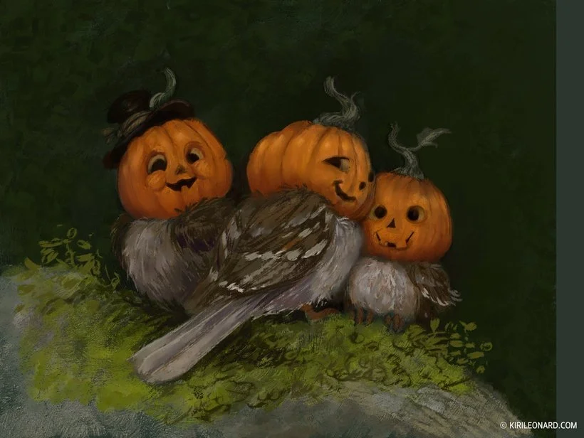
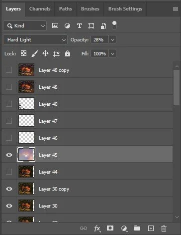
14. Haze
Last this to do is to add some environmental haze! I make a new layer that I dapple with purples, pinks, grays and blues.
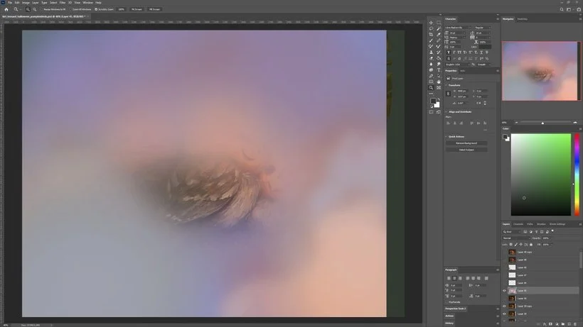
Then I set it to 'Hard Light' and drop the opacity of it down to 28%.
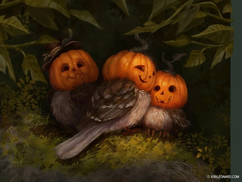
15. Final Touch!
You can see the effect of the haze we added in previous step here. Now the last step is adding a few foreground leaves to enhance the effect of the viewer peeking at the birds through foliage.
Lastly I dot in some glowing dots just for that extra touch of magic and whimsy - and we're done!

I hope you enjoyed this tutorial and learned something from it. Thank you for reading!